Sony Pictures Imageworks Spreads More Than Its Wings in ‘The Angry Birds Movie 2’
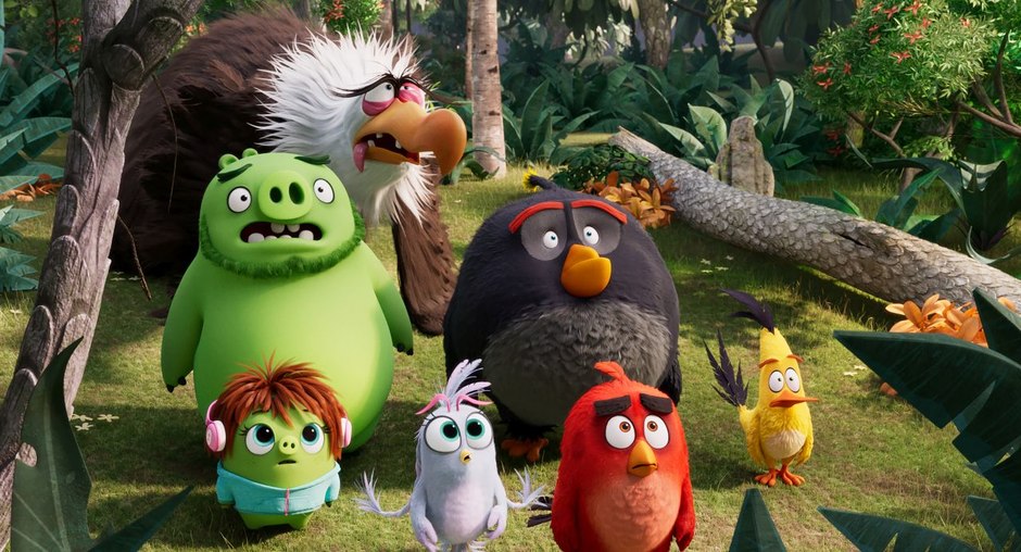
Since Rovio’s first Angry Birds game launched back in 2009, various versions of the hugely popular property have been downloaded more than 4 billion times, spawning a franchise that includes, along with numerous comics, books, theme park attractions and four animated series spinoffs, their latest CG animated feature film, The Angry Birds Movie 2, the sequel to their 2016 hit, The Angry Birds. Produced by Sony Pictures Imageworks, Angry Birds 2, as it’s called, brings us back once again to the amusing and sometimes idyllic confines of Bird Island and neighboring Piggy Island, complete with feuding angry birds and green piggies, who suddenly find themselves needing to work together against a new foe, a villainess named Zeta, bent on conquering their tropical home.
For Stirling Duguid, a CG supervisor on the first film, Angry Birds 2 meant stepping up to tackle the VFX supervisor role for the first time. Working in tandem with animation supervisor Pete Nash, Duguid was responsible for a considerable amount of what ended up on screen. “Pete and I were a team,” he explains. “He took care of all of the animation and movement of the characters. I was responsible for everything else, as far as whether it’s cropping feathers, or effects, or the look of the final composite. Our job was to take production designer Pete Oswald’s artwork and concepts, along with the director and producer’s, and execute on those to make them a reality.”
Duguid started on the film very early in pre-production. As a sequel, Angry Birds 2, as you might suspect, made use of many assets from the first film. However, everything needed updating and tweaking to facilitate integration with Imageworks’ current production pipeline system and technology. “I was basically the first one on the production,” he shares. “Our initial tasks primarily involved restoring many of the assets from the first movie. You’d think that would be a relatively easy and straight forward task, but it’s actually quite challenging considering those three and a half years, from the beginning of the first movie to the beginning of the second movie, saw quite a bit of technology change at the studio.”
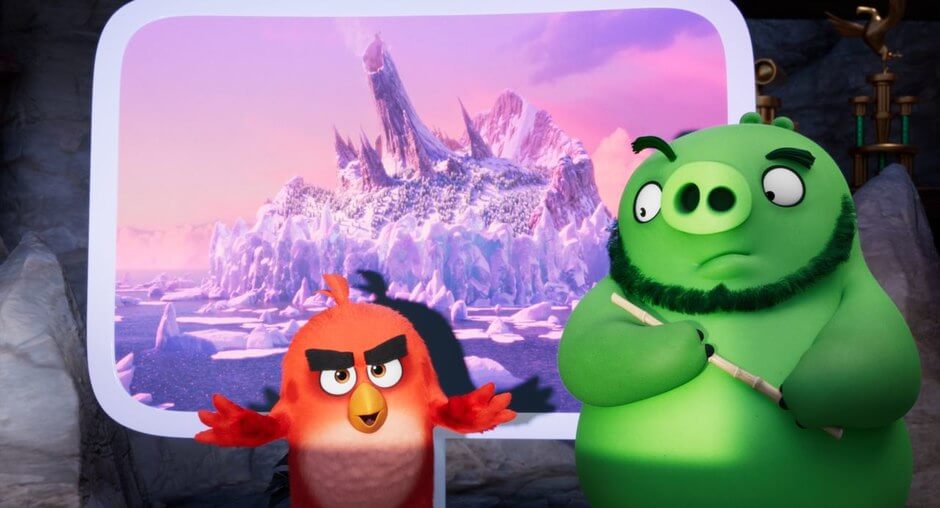
“Some of our tools are different now,” he divulges. “We have a different grooming system… how we groom characters with hair and feathers. We have some new rendering techniques. Also, at our facility, we’ve been switching each show over to the ACES color space. It was actually quite a challenge to restore all the old assets and get them to look the same in the new color space. So, early on, and into the first part of the production, our effort was focused on restoring the old assets, including environments and characters, and getting our new characters and environments in line.”
The production team’s early work also involved development of the film’s new characters and environments. “We started to get initial artwork right away for the new characters, which were Silver, Zeta and Harvey, along with a host of Zeta’s eagle guards,” Duguid notes. “Taking that artwork, we started from scratch with modeling and texturing, working through iterations with the client. And obviously, this being a sequel, we had very clear targets as far as the look and feel of the movie. The assets from the first movie, the characters and the environments, we wanted to look the same.”
The film’s main new character, the villain, Zeta, proved particularly challenging. “Zeta by far was the most complex character on the movie,” Duguid declares. “In general, the techniques for how we rig a character for animation are basically all the same. But when you get into the specifics of the character, that’s where things differ a lot. For instance, Zeta was very complex. In the end, we had around 1,200 controls that animators could use to manipulate her. Part of that was because she had a long, thin body that was very dynamic. Also, it’s because she had this huge mane of feathers that grew out from her face. She basically had twice the number of controls as Red, our next most complex character.”
“Zeta had tons of feathers,” Duguid laughs. “700 feathers and over 8.4 million hairs. One of the unique things we noticed about her in the first illustration given to us was that she had feathers growing right out from the edge of her face, her eyes and right around her beak. There were hairs and feathers that shot right out like a lion’s mane. We knew right from the start that she would be challenging. The mouth has a lot of expressions, moving from a large smile to a frown. We didn’t want her mane to be moving up and down a lot as she talked or emoted.”
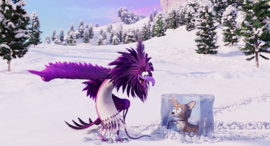
In finalizing the translation of Zeta’s original look into a rigged, animatable 3D model, Duguid’s team had to adjust the design in order to accommodate the realities of how it would look once in motion. “We had to make some compromises as to how we moved forward from the initial illustrations,” Duguid states. “Basically, we had to add quite a few more spans between the corners of her mouth and where the first feather grew, so that we could have some shearing there. We added some short hairs to capture the spirit of the artwork. But we couldn’t duplicate it exactly because technically, it would look kind of funny when she was talking and emoting.”
While it may seem obvious, one of the film’s biggest challenges was animating feathers, which according to Duguid, were much more difficult to create and animate than hair. “Feathers are way more difficult than hair, for sure,” he admits. “The look of our birds is very much a hybrid of feathers and hair. If you look at Red, the base of his body, his torso, there is definitely a hair layer with feathers as accents. There are quite a few more feathers around the arms. It depends on the bird. For Mighty Eagle or Zeta, their wings are just full on feathers. We actually have four different styles of feathers that we use that also adds to the complexity. Feathers are unforgiving.”
Imageworks began developing their feather system back when they worked on Stuart Little (1999), and still uses a lot of that technology. “We’re at the point now where we’re exploring new options for feathers and how we can work with them more efficiently,” Duguid acknowledges. “But Angry Birds 2 definitely used more of our traditional approach. To put it bluntly, feathers are really hard!”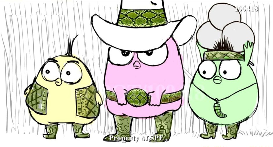
Storyboard frame from sequence starring hatchlings Zoe (pink), Vivi (green) and Sam-Sam (beige).
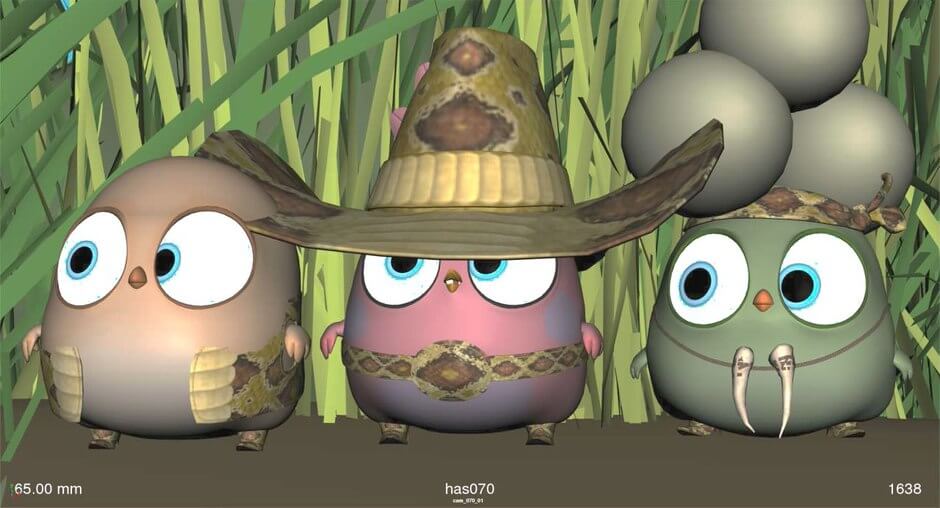
Layout frame.
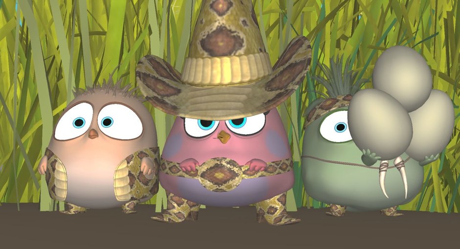
Animation frame.
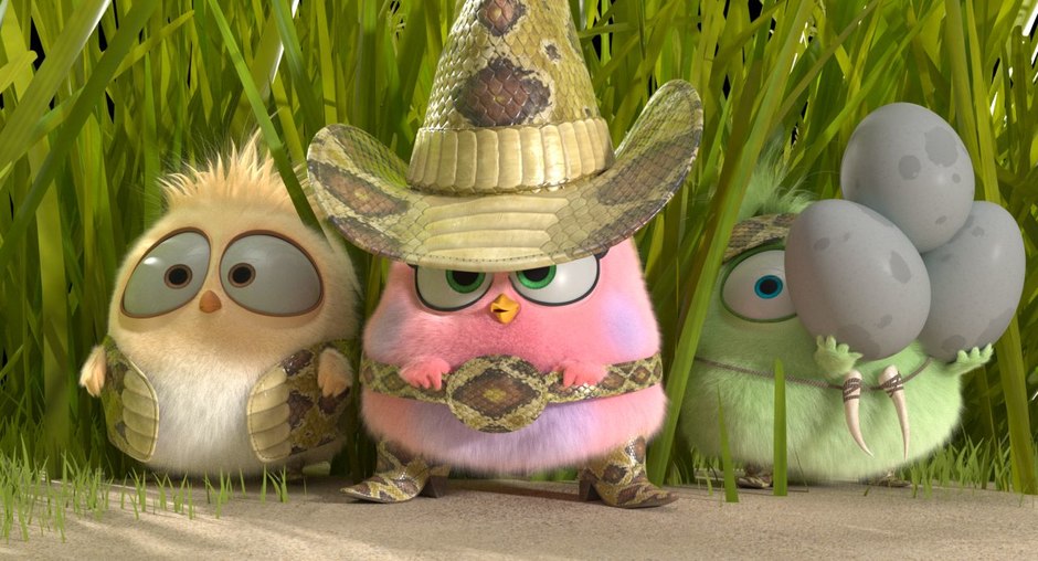
Hair frame.
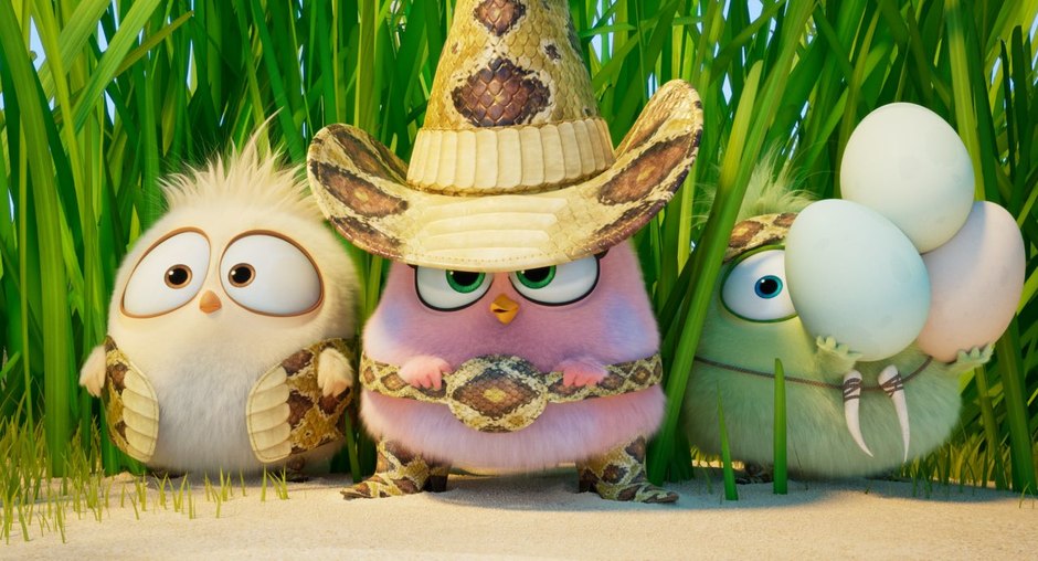
Composited final frame.
The film also required a substantial range of effects, including water, snow, molten lava, lava lamp lava and ice balls, used on a number of main scenes as well as short gags. “There was quite a mix of effects, including a lot of one-offs,” Duguid reveals. “Oftentimes, we use effects across multiple shots and sequences. But this movie had many gags and little moments that required just one or two effects shots. It’s interesting how many different types of effects there actually are in the movie.”
For example, according to Duguid, they had to create all sorts of water. “One of the big ones for us was water. Specifically, we had all kinds of water: lake water, hot tub water, ocean water and underwater. It was also a big task to develop the new beach break, which we had in the first film but was never seen quite as closely or in as many shots.”
“We also had volcanic lava and lava lamp lava,” he continues. “All the tubes inside the super weapon look like lava lamps. When the lava gets injected into the ice balls, it turns into more realistic looking lava like you might see in a volcano. Then those ice balls fly through the air, explode and destroy things. And, we had this pig snot that Bomb and Chuck rubbed all over their bodies and ended up swimming in. We had a lot of snow and ice because Zeta’s island is all snow and ice. I always find snow challenging because we’re mixing between the solid surface of the snow on the ground with volume rendered snow that’s the results of dynamic simulations of say footprints, or a character slamming into the side of a snow wall. Getting the shading to match between the solid surface and the volumetric render is quite a challenge and takes some iterations and a lot of really good comp work to match it all up.”
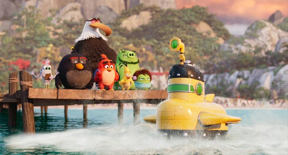
In addition to a variety of design and effects challenges, a shortened schedule and talent overlap with the studio’s Oscar-winning hit feature, Spider-Man: Into the Spider-Verse, impacted the production as well. “We got crunched a bit at the end of the pipeline in lighting and comp because the studio moved the release date up by three weeks,” Duguid asserts. “That cost us three weeks on the back end. Then, animators we expected to get earlier didn’t come on as planned because they were needed longer on Spider-Verse. So, we got crunched in the middle a bit as well as far as the lighting part of the pipeline. We just had to work it out to get through what ended up as almost 2,000 shots.”
As if often the case with constant refinement, updating and innovative new development surrounding most studios’ CG animation pipelines, the introduction of new tools can suddenly mean considerable time savings by fundamentally changing how certain tasks are handled. “Our systems and software dev team had been working on some tools, like plug-ins for Katana, that enabled us to move more towards a sequence lighting model,” Duguid says. “This meant one key lighting artist was able to light all the shots in a given sequence much more easily than in the past. We were able to start key lighting right out of rough layout. So even before animation had even started, we could start seeing the whole sequence in key lighting with the click of a single button in Katana. We lit shots in about half the time it took in any of the previous eight animated features we’ve done at Imageworks.”
However, for Duguid, the biggest factor positively affecting Imageworks’ production efficiency and ultimate success on the project was the high degree of preparation the director, Thurop Van Orman, and Oswald brought to the production. “We had a very collaborative client with our director, Thurop, and Pete Oswald,” he emphasizes. “They had a very clear vision; they storyboarded the whole movie and really stuck to it. They also hit all of their deadlines, which was a tremendous help. They weren’t doing a lot of exploration once they handed stuff over to us. We were extremely efficient because their vision was really clear. We just had to execute it.”
For the first time VFX supervisor, Duguid looks back fondly on the project. “I’m really proud of the work we did on this film,” he concludes. “The images you see on screen are spectacular. They look beautiful… the effects are amazing, the animation is outstanding and the project ended up running very, very smoothly. It was really a pleasure working on this film. For my first show as a VFX supervisor, I lucked out. I loved it. It was fun!”
By: Dan Sarto
Source: AWN

熱門頭條新聞
- 2024 Developer Showcase and look ahead to 2025
- Jumping Jazz Cats will launch on PC January 30th
- Lexar Announces Two Portable SSDs
- Quell Announces Hit Game Shardfall is Coming to VR
- The films of the Panorama and World Vision at the 11th Duhok International Film Festival were introduced
- GRAND MOUNTAIN ADVENTURE 2 SMASH INDIE MOBILE HIT RETURNING TO THE SLOPES FEBRUARY 6, 2025
- Airships: Lost Flotilla Release Date January 23rd
- BLOOD STRIKE’S WINTER EVENT BRINGS NEW GAME MODES, EXCLUSIVE REWARDS
