Street art and 21st century London: How the 101 Dalmatians reboot adds edge to a Disney classic
While the Disney film machine seems currently intent on churning out live action adaptations of cartoon classics like Dumbo and The Lion King in a note for note fashion, it seems the corporation’s TV adaptation is once again bucking trends.
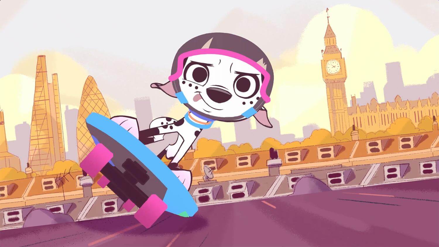
Recent animation series from their kids division is making use of inspired tech to resurrect favourites like the Muppet Babies, while shows like Fancy Nancy are bringing more nuanced female depictions to the small screen for little ones. It’s in that same vein in which the Disney Channel’s new 101 Dalmatian Street series operates, transporting the pesky pups of the beloved 1961 classic into a side of London familiar with those who come to the city more for a Banksy walking tour than yet another trip to Buckingham Palace.
“The heritage of London from One Hundred and One Dalmatians was in the concept for the show from the very beginning,” explains series director Miklós Weigert over the phone. “Having it in contemporary London was also very important.”
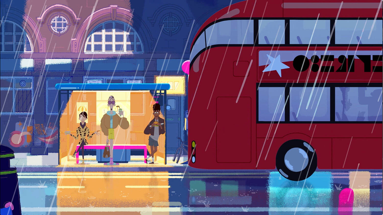
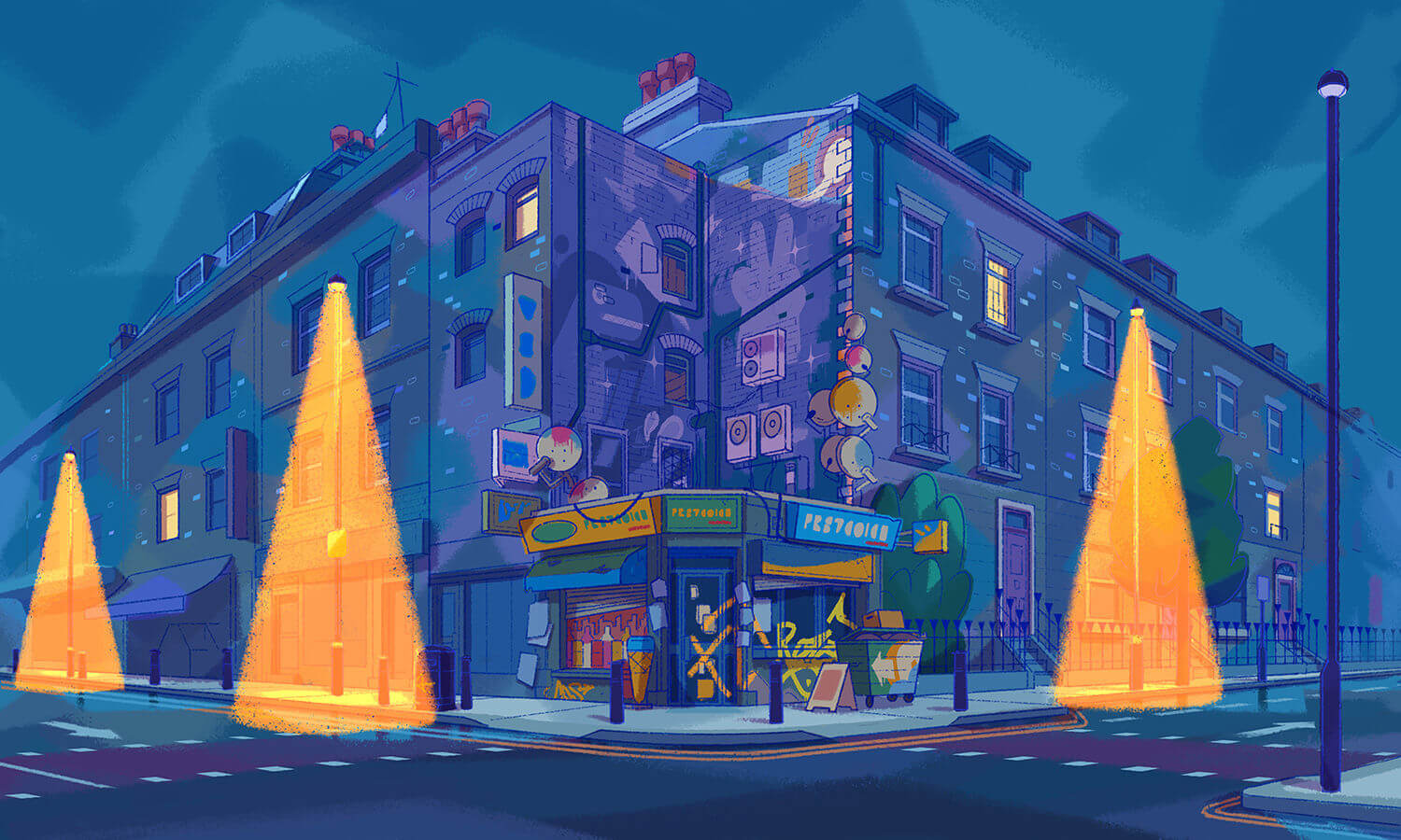
Miklós and team worked hard to show the London we all know and love, moving away from the polished and stately face of London from the original film to incorporate all its murals, black cabs and even them damn pigeons.
This modern look also extends to the show’s human protagonists, who all look like the sort you see in Camden, where the majority of the cartoon is set.
“The way they dress and talk is very much like in London 2019 – quite outlandish,” explains episodic director Jez Hall. “There’s some fantastic trousers on show, too.”
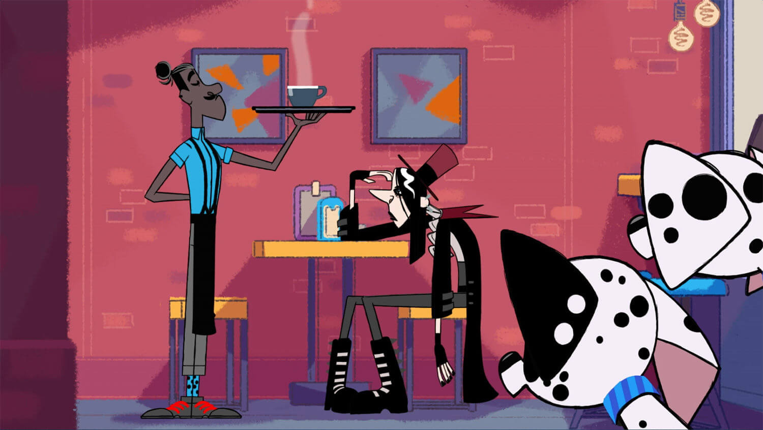
While modernity is the name of the game, the series creators found themselves drawn to the storyboards of the original movie, as provided by Disney to Miklós, Jez and team at London’s Passion Animation Studios.
“The biggest influence was the original artwork (below),” explains Miklós. “We started breaking it down into the elements that we wanted to keep, like the geometry and line work, so that gave us a very strict style guide.
“After that, we also wanted to make it very contemporary, so we started making changes – but all in the spirit of the movie.”
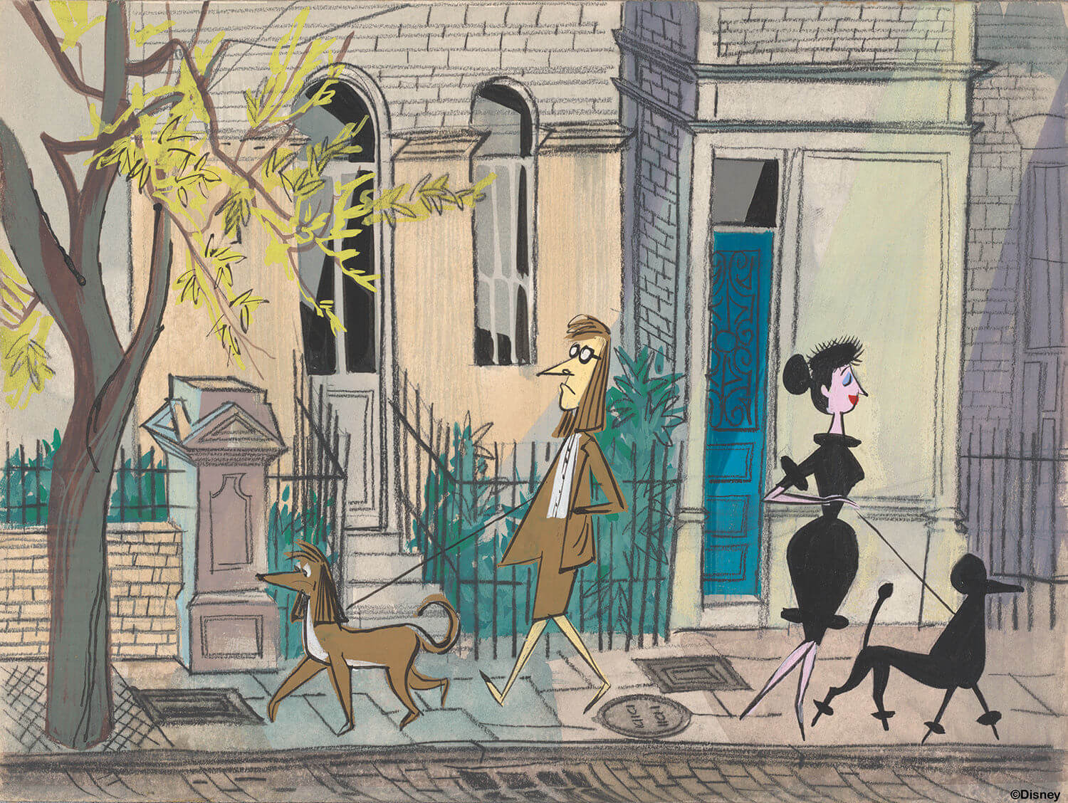
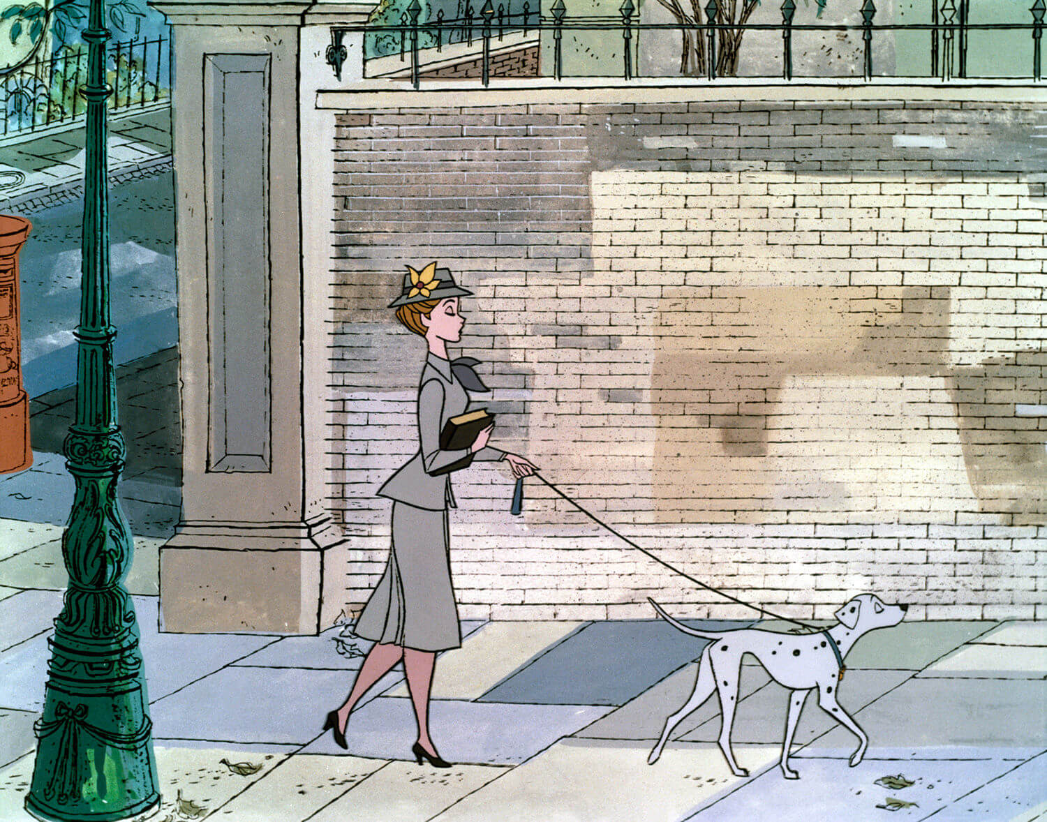
“You can see though changes in how we approach background art,” the director continues. “You see a lot of murals, and different colour palettes in some locations according to the mood of the scene.
“When it’s a funny, family driven comedy then we’re using brighter colours. But there are moments in the season where we do go to some pretty dark places and they can be almost as scary as a movie.”
Source from: https://www.digitalartsonline.co.uk
ByGiacomo Lee

熱門頭條新聞
- SAVE THE DATE OF ANNECY 2025
- LEGENDS BMX Drops onto PlayStation for the Ultimate Extreme Sports Showdown!
- Bubble Ghost Remake Now Haunting PC & Consoles
- THE “ARK: ANIMATED SERIES 109-COSTUMES PACK” AVAILABLE NOW FOR ARK: SURVIVAL ASCENDED
- The Date of Spring and Future: the Animation and Film section of the 15th Beijing International Film Festival
- GODDESS OF VICTORY: NIKKE 2.5 YEAR ANNIVERSARY SPECIAL LIVESTREAM SET FOR APRIL 19
- AHOY, MATEY! 2.5D ACTION PLATFORMER ‘SEAFROG’ HEADS TO STEAM ON APRIL 15TH
- Puella Magi Madoka Magica Magia Exedra -Kioku [Tiro Finale] Mami Tomoe
