Breaking Down a Scene in BUCK’s ‘Invention of Together’ Tinder Ad
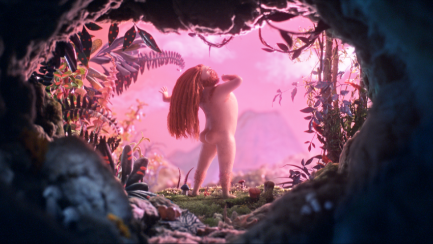
In BUCK’s advertisement for dating app Tinder, “Invention of Together,” viewers see the progression of dating and relationships, from the caveman era to modern day.The team at BUCK, who also produced SIGGRAPH 2019 Computer Animation Festival selection “Share Your Gifts,” successfully captured the modern-day phenomenon in a seven-second scene that uses a combination of CG-based character animation and storytelling. To dive into how they did it, Joe Mullen, creative director for the project, and Doug Wilkinson, head of CG for the project, break down the scene.
Defining the story
Wilkinson shared that “Tinder wanted to establish itself as an app that brings people together.” Steering away from the negative connotations many dating apps face, they came to BUCK with this core idea: Tell the classic story of “man meets woman” through the lens of history, and position Tinder as a positive evolution in that long chain of events.
Tell the classic story of “man meets woman” through the lens of history, and position Tinder as a positive evolution in that long chain of events.
“The story is a kind of a David Attenborough take on the human mating ritual told through narration at a mellow, unhurried pace,” shared Mullen. “Because of the potentially sensitive subject matter, we wanted to approach the project with a degree of humor and lightheartedness, while at the same time being genuine and warm — a feeling with which Tinder was interested in associating their brand — and shy away from anything overly provocative.”
Building the team
Because of a somewhat tight budget, Mullen noted that BUCK had to keep the team pretty small and, ultimately, approached the project as an opportunity to experiment and play around with new techniques.
“Our approach allowed us to be flexible and free form, adjusting and refining our process as it progressed,” said Mullen. “The project was made with roughly 20 people (not all at once), and took around three months from concept to final render, with various teams sequenced on and off as need changed.”
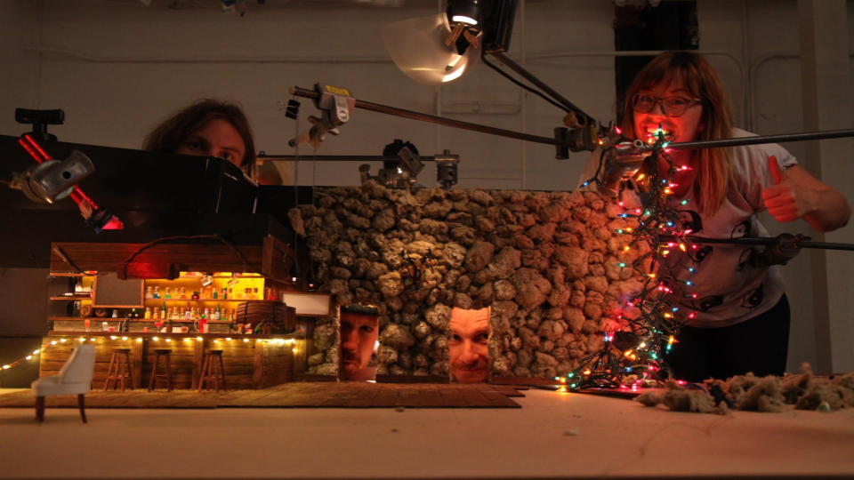
Image courtesy of BUCK
Nailing the design
According to Mullen, the biggest challenge was capturing the character performances in animation.
“We were inventing a process we had never done before, marrying practical environments and moving cameras with CG characters,” he shared. “It turns out that creating animation that’s not overly exaggerated and ‘cartoonish’ can be quite difficult. It’s almost as if the animators had to unlearn everything they’d been taught about human performance, particularly in the commercial world.”
It turns out that creating animation that’s not overly exaggerated and ‘cartoonish’ can be quite difficult.
Mullen noted that nailing down the pace also brought challenges of its own.
“The slow, relaxed pacing also presented some real challenges — how to tell the story of man and woman in just over one minute without using any of the typical animation tropes, such as exaggerated performances and tight editing to squeeze a bunch of scenes in,” Mullen shared. “Instead, we let some scenes meander and play out a bit longer than we’re used to in commercials, giving it more of a cinematic quality, but also limiting the number of different scenes we could use to tell our story.”
Mullen also shared that matching the character performances to the relaxed pacing of the film is a lot easier said than done. “Typically, in the commercial world, you’re trying to fit as many character actions into the least amount of screen time — time is money — leading to very energetic and, sometimes, entertaining performances. But here, the challenge was almost the opposite,” Mullen explained. “We had to work through how to have fewer big actions, but still keep the characters alive with all the subtle micro-actions, shifts in weight, and slight pauses and adjustments that bring the animation a little closer to the real world, making our CG characters feel at home in the tactile, practical sets.”
The details were strategically sculpted by varying frame rates and meticulously blending the CG with the handmade environments. “The environmental animation was shot on camera, mostly at high speed, so that we could change the frame rates later. This was to make some of the moving set elements, like the waterfall, feel as if they were on a larger-scale,” Wilkinson noted. “The characters were done with 100% CG-based character animation, in a style and frame rate to give a handmade, but not stop-motion, look. It was important that the motion had a style that felt unified with the look of the rest of the environment.
The team also knew they wanted to utilize these handmade environments as much as possible. “We wanted a specific and unified visual texture that felt handcrafted and inviting throughout the entire environment,” Wilkinson explained. “We felt that CG characters would be the best way to stick to this design philosophy and also make sure that we could still get the movement and storytelling that we wanted from the characters. The CG look dev was made using complex procedural shaders, as traditional texturing techniques wouldn’t provide the micro-details needed to match the fabricated materials.”
Breaking down the scene
Before design began, the backstory had to be developed. “As we like to do with all our character scenes, we give each character a backstory or mini narrative so that we have something to design to and a way of building out the larger world. Even if the audience doesn’t pick out every little detail, at a glance, one still gets the feeling that these characters are part of a larger world beyond the frame, which draws you in and makes you care a little bit more,” Mullen explained. “We wanted all the couples in the bar scene to be unexpected and diverse — representative of the world at large and not an idealized romcom version of romance.”
To build this representative world, the team created a single pair from which all the other couples would be based on.
“To fit with the overarching historical concept of the piece, we decided that we were going to design a single male character and a single female character, and that all other characters were just variations of that one pair, reinforcing that idea that they represent every man and every woman. The caveman and woman are not Adam and Eve,” Mullen shared. “They are the archetypal male and female — stand-ins for all of us. It was a really fun design challenge to create a diverse and interesting cast of characters from this single base pair, and it actually turned out to be a great constraint to have. Sometimes less is more, and setting up specific rules for the world can result in more thoughtful and intentional design, rather than restricting it.”
The bar scene specifically opens with two familiar faces, with the first pair carrying over from the previous scene. “The man was the one stretching with his rosy behind to camera, and then we see the woman’s profile photo on his phone as he swipes right (Tinder for ‘yes, please’),” Mullen said. “They’re a mixed-race couple. The man is of Asian descent and the woman is of African descent — apparently a controversial combination in some parts of the world — but again, the core concept was to challenge existing stereotypes and be as inclusive as possible. To the left of them, we see a southern European bartender (a young Yanni?) chatting it up with an East Indian woman.”
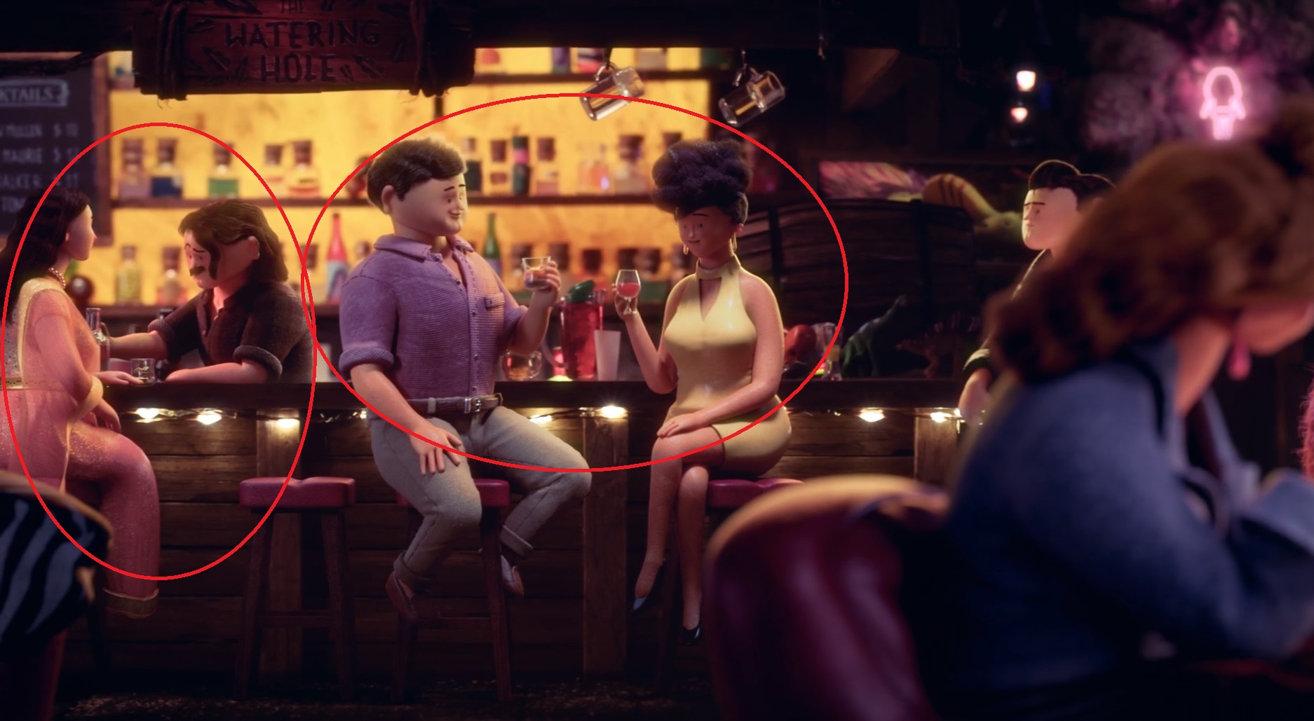
Still from “Invention of Together,” courtesy of BUCK
Details placed throughout the bar tie the scene back to previously shown time periods. According to Mullen, comparing the pre-Tinder to the post-Tinder world was a core conceptual idea for the advertisement, seen in both reprising the cave people with their present day equivalents and reprising the prehistoric watering hole with its contemporary counterpart — a local bar.
Mullen noted that the team intentionally peppered in some “Easter eggs” to merge the two worlds. “There’s a sign at the top of the frame showing the name of the bar: The Watering Hole. The architecture of the bar itself is a little rough-hewn — another nod to caveman times. If you look really closely, just to the right of the woman in the yellow dress, there’s a pair of dinosaurs sitting on the bar, and just above them, behind the cask, there’s a partially obscured painting on the wall that shows a closeup of the feathered dinosaur from the caveman scene,” Mullen explained. “The rock wall at the back of the bar is another little call-out to the scene with the cave couple hanging in their cave, which is made of the same industrial insulation material.”
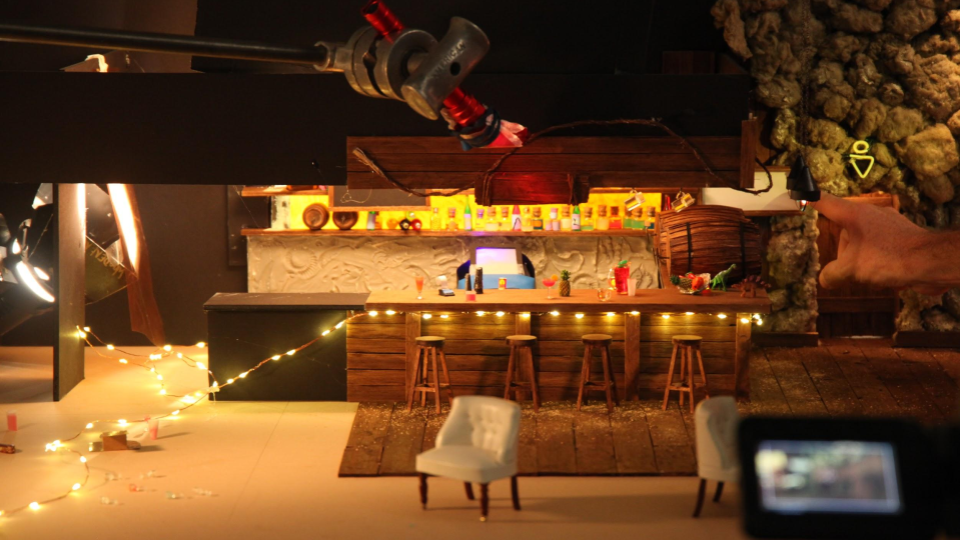
Still from “Invention of Together,” courtesy of BUCK
Did you notice the color of the men’s restroom sign? According the Mullen, the team swapped the typical colors of men’s and women’s restroom signs as another subtle challenge to existing norms, as they did with all of the pairings in this scene.
The lighting, on the other hand, was designed to feel like home. “The back side of the bar set is a physical set with some built in lighting. These lights are small touches that feel very comfortable, like your favorite bar from any town,” Mullen shared. “The characters and tables in the foreground are all CG and the lighting there is meant to be a mixture of what you’d find in a real cozy bar and the kind of theatrical or small stage lighting you get when shooting miniatures. Overall, we want the bar to feel inviting and warm, but still look like it was all shot together on a very small-scale stage.”
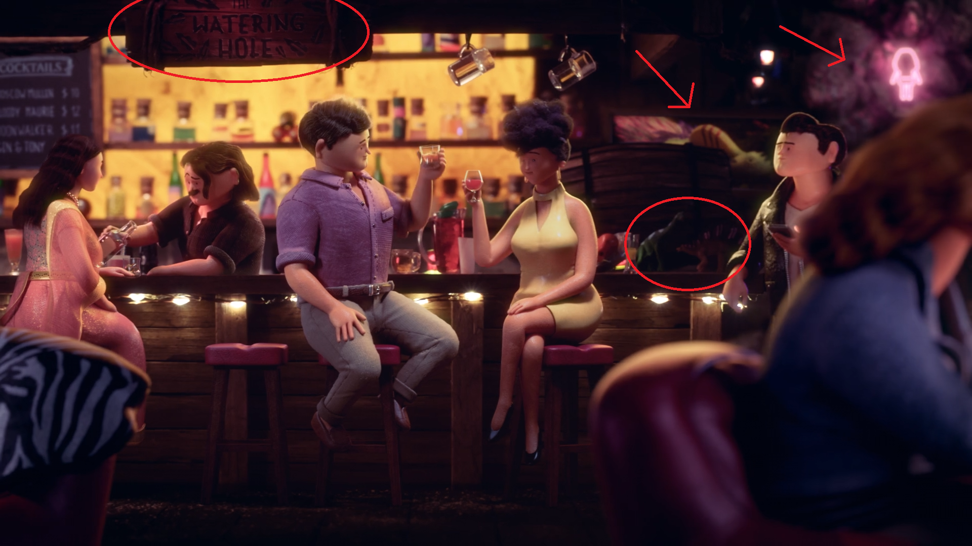
Image courtesy of BUCK
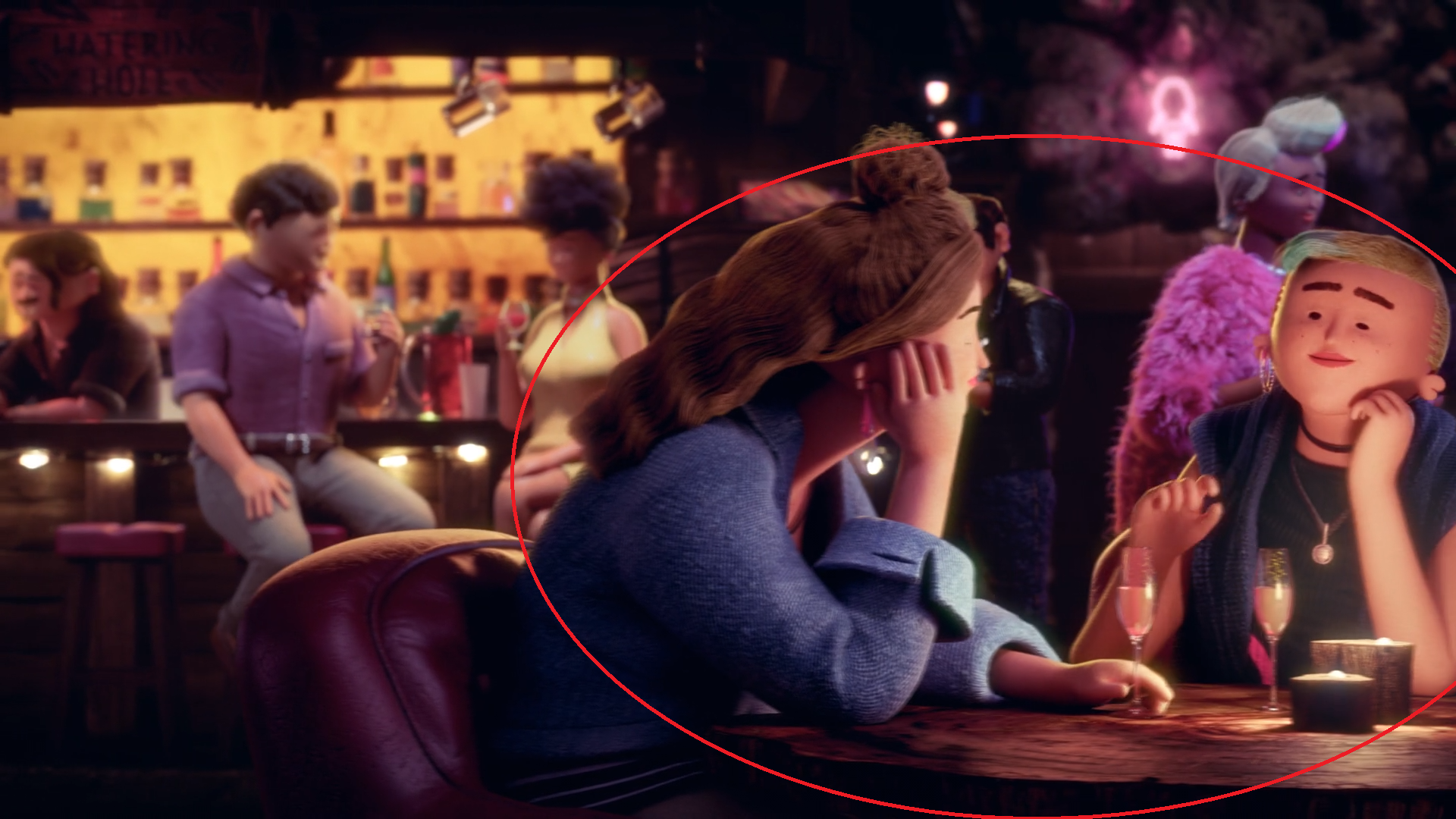
The scene progresses with the narrator saying “they got together with who they wanted,” and the camera pans to the second pair, a lesbian couple drinking wine.
Still from “Invention of Together,” courtesy of BUCK
The narrator continues with “when they wanted,” while the camera pans to the third couple. Mullen explains that the team paired this phrase with this couple to emphasize time and life stages. “Here we see an older black woman (the ‘when’ here being her age), defined by her prominent pearl necklace and fur coat, along with her white hair and old-timey reaction to her suitor’s peck on the cheek,” Mullen said. “This type of reaction was chosen because we didn’t think white hair by itself would be enough of an indicator of age, as it could be perceived as a style choice. We paired her with a younger Latino man, defined by his tattoos and chiseled contemporary hairstyle.”
Still from “Invention of Together,” courtesy of BUCK
The men in the back of the bar have their own story — a clear history with an elusive future. Mullen dives into their complicated narrative, explaining, “We see the same male gay couple that we saw a few scenes earlier being separated by a priest — they’ve time traveled to present day and discovered Tinder.”
“We see the one with the black leather jacket looking at his phone, presumably swiping on Tinder, and, as we keep panning, we catch a glimpse of his friend entering the bathroom,” Mullen said. “Did they just break up and he’s now back on Tinder? Are they polyamorous and he’s looking for a third? Or, did their memories get wiped when they got transported from the ’50s, and they’re now just two dudes in a bar? The answers to these important questions are locked in the archives at Tinder HQ, and we may never know the real truth!”
Still from “Invention of Together,” courtesy of BUCK
The last we hear from the narrator in this scene is “and getting together was fun again.” Mullen shared that the focus shifts from the second couple to the others in the background to show all having a a good time and at ease. The team also timed the laugh of the first couple to coincide with the narrator speaking “fun again,” and added a subtle sound design laugh to draw attention to this important phrase.
“We had the man in the third couple giving the ‘call me’ sign as a way of continuing the narrative beyond that scene, leaving viewers wondering how the story would play out,” Mullen said. “This is also something an older woman might not see very often, and it elicits a fun giggle and shimmy from the her that also accentuates the ‘fun again’ phrase.”
Emphasizing diversity and representation
According to Mullen, ensuring all of the scenes were diverse and inclusive was vital to executing Tinder’s vision. “Representing as many variants of human interaction was a core concept of the piece and a central part of the Tinder rebrand,” Mullen said. “We were very conscious of making this scene, in particular, as representative as possible. Prior to this scene, we are seeing examples of some of the ‘wrongs’ throughout history, and this is the scene where we contrast that with how acceptance can and should be achieved.”
The overall design and execution required all hands on deck from the BUCK team. “This scene is one of the best examples of our highly collaborative process working well,” Wilkinson shared. “Both the set details and the CG characters look as if they were created by the same hands, even though they were built at different times and by very different teams. To create this cohesive design, fabrication and CG must have the same visual and emotional goal. It’s all very magical when we get it right!”
SIGGRAPH 2020 Computer Animation Festival Electronic Theater submissions are open now through 17 March. When it comes to submitting, Mullen offers the following advice: “Nail the story before you dive into design and production. [Your] film should work well in storyboard form — if it doesn’t elicit the proper feeling as a ‘boardomatic’ (an edit of the film using the storyboards), it’s not going to work with any amount of beautiful design, animation, or polish. Then, play, experiment, and don’t be afraid to take risks with the execution. You already have a working film at that point, and the production technique is just the cherry on top.”
Joe Mullen is the group creative director at Buck. He has been with the company for 14 years and has worked on a variety of projects and story lines.
Doug Wilkinson is the global head of 3D at Buck. He has been with the company for 13 years and has had his hands on many different animated works and projects.
Source:SIGGRAPH

熱門頭條新聞
- Slow-Motion Collapse: How Nostalgia, Streaming, and Short-Sightedness Undermined Hollywood’s Future
- PBS NOVA / GBH JOINS THE PRODUCTION OF ZED AND ARTE’S PREMIUM DOCUMENTARY THE LOST TOMBS OF NOTRE-DAME
- Biopunk Action Title Sonokuni Launching Early 2025
- LifeAfter Season 7 “The Heronville Mystery” Brings a Brand New Folklore Horror Theme for a Unique Survival Experience
- 2024 Developer Showcase and look ahead to 2025
- Jumping Jazz Cats will launch on PC January 30th
- Lexar Announces Two Portable SSDs
- Quell Announces Hit Game Shardfall is Coming to VR
